 by
by 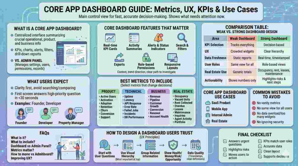
A core app dashboard is the main control view where users track KPIs, system status, user activity, and business outcomes in one place. Its purpose is fast, accurate decision-making.
A weak dashboard displays data. A strong dashboard shows what needs attention now. Users open dashboards to check risk, progress, performance, revenue, or operational pressure.
What Is a Core App Dashboard?

A core app dashboard is a centralized interface inside an application that summarizes the most important operational, product, and business information. It includes KPIs, charts, alerts, filters, and drill-down reports.
An admin panel manages settings, users, permissions, and records. A dashboard explains what is happening, what changed, and where action is required.
For real estate platforms, it may show occupancy rate, rent, maintenance, lease expirations, leads, agent performance, and portfolio value. For SaaS products, it may show users, churn, errors, uptime, and revenue.
What Users Expect
Users expect clarity first. If the dashboard forces them to search, compare manually, or guess what matters, the design has failed.
The first screen should answer the user’s highest-priority question in 30 seconds or less. A founder asks, “Are we growing?” A developer asks, “What is breaking?” A property manager asks, “Which unit needs action today?”
Core App Dashboard Features That Matter
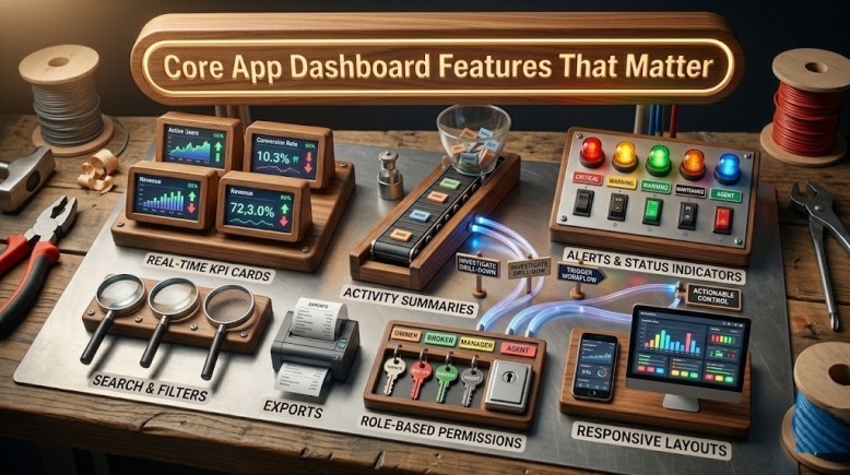
The strongest dashboards combine summary metrics with specific next steps. A KPI card alone is not enough. Users need context, trend direction, and a clear path to investigate.
Essential features include real-time KPI cards, activity summaries, alerts, status indicators, search, filters, exports, role-based permissions, and responsive layouts.
Owners, brokers, agents, and managers should not see the same screen.
Comparison Table: Weak vs Strong Dashboard Design
| Area | Weak Dashboard | Strong Dashboard |
|---|---|---|
| KPI selection | Tracks everything available | Tracks decision-based metrics |
| UX | Crowded widgets | Clear hierarchy |
| Data freshness | Static reports | Real-time or timestamped data |
| User roles | Same view for all users | Role-based views |
| Real estate use | Generic property totals | Occupancy, rent, leases, leads, maintenance |
| Actionability | Shows numbers only | Highlights risks and next steps |
Best Metrics to Include
A core app dashboard should not become storage for every metric. Select metrics that change decisions.
For product teams, track active users, activation rate, feature adoption, retention, churn risk, conversion rate, and support volume.
For technical teams, track uptime, latency, API response time, error rate, failed jobs, incident count, and database performance.
For business teams, track revenue, pipeline, customer growth, conversion, renewal risk, and account health. For real estate teams, track occupancy, vacant units, rent collected, overdue payments, lease expirations, maintenance, inquiries, agent activity, and portfolio performance.
How to Design a Dashboard Users Trust
Start with user questions, not chart types. Define who uses the dashboard and what decision they must make.
Use visual hierarchy with the most important metric at the top. Group related information together. Avoid forcing revenue, error logs, tenant requests, and user growth into one block.
Performance should show health. Revenue should show money movement. Property data should show risk and opportunity.
Trust also depends on data quality. Show timestamps, source labels, and clear KPI definitions. If “active user” means different things across teams, the dashboard creates arguments.
Core App Dashboard Use Cases
A SaaS product dashboard monitors growth, activation, retention, and usage. A mobile app dashboard tracks sessions, crashes, installs, engagement, and device performance.
An internal admin dashboard controls users, roles, payments, records, and workflows. A real estate dashboard connects leasing, rent collection, maintenance, portfolio health, and agent output.
Common Mistakes to Avoid
Do not build the dashboard around vanity metrics. Page views, total users, or total properties may look impressive, but they rarely tell teams what to do next.
Do not give every user the same view. A developer does not need broker lead rankings. A leasing manager does not need API latency unless it affects workflow.
Do not overload the interface. More widgets often mean slower decisions. Use drill-downs for detail instead of forcing every data point onto the main screen.
Do not ignore security. A dashboard may expose revenue, tenant records, behavior, or system issues. Use role-based access control, audit logs, and least-privilege permissions.
Final Checklist
A high-performing core app dashboard should answer urgent questions, highlight risks, and move users toward action. It should be simple enough for daily use and structured enough for serious decisions.
Before launch, confirm four things: the KPIs match user roles, the data is accurate, the layout is clean, and every major metric supports a decision.
A dashboard is successful when teams use it to act faster, reduce risk, protect revenue, and manage performance with confidence.
FAQs
What is a core app dashboard?
A core app dashboard is the main screen where users monitor key metrics, app performance, activity, and business results.
What should a core app dashboard include?
It should include KPIs, alerts, charts, filters, user activity, system health, role-based views, and drill-down reports.
Is a dashboard the same as an admin panel?
No. An admin panel manages settings and records. A dashboard summarizes performance, trends, risks, and decisions.
Which metrics matter most?
The best metrics are tied to action: revenue, retention, uptime, errors, occupancy, leases, leads, and customer activity.
How do you improve dashboard UX?
Start with user roles, reduce clutter, show priority metrics first, label data clearly, and make next steps obvious.