 by
by 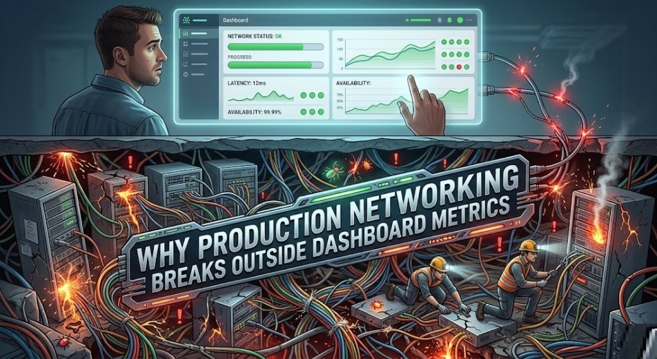
Production networking breaks outside dashboard metrics because dashboards show sampled internal signals, while outages usually emerge across user paths, external dependencies, and recent changes the dashboard does not correlate fast enough.
That is the core failure. Teams trust what the dashboard can display, but users experience the network as a full path that includes DNS, load balancers, cloud edges, third-party services, and application dependencies.
A green dashboard does not prove a healthy service. It only proves that the monitored signals stayed within the thresholds you chose to collect, store, and visualize.
- Why users feel network issues before dashboards confirm them
- What dashboards miss in real production environments
- The technical reasons dashboard visibility breaks down
- Where production networking actually fails first
- How mature teams investigate what the dashboard cannot explain
- What better observability looks like in practice
- Dashboard metrics vs production reality
- A practical checklist to reduce dashboard blind spots
- What to fix first
- FAQs
Why users feel network issues before dashboards confirm them
Users do not care whether the fault sits in BGP routing, DNS latency, east-west traffic, a load balancer health check, or an expired certificate. They feel delay, broken sessions, and failed transactions.
Dashboards, by contrast, often focus on device health, interface utilization, CPU, memory, and alert thresholds. Those metrics matter, but they do not describe the full user journey.
That gap is why production incidents often begin as a business problem, not as a monitoring event.
The gap between customer experience and internal telemetry
Internal telemetry is usually partial, delayed, and scoped to owned systems. The user path is broader and less forgiving.
A customer request may cross your edge, a CDN, a DNS provider, a WAF, a load balancer, an API gateway, a Kubernetes ingress, and several service calls before it fails. Your dashboard may only visualize two or three of those layers well.
When one unobserved link degrades, the dashboard can remain calm while revenue, support volume, and customer trust move in the opposite direction.
Why latency, jitter, and packet loss hide in averages
Averages are dangerous in production. They make unstable systems look normal.
A five-minute average can hide a 20-second burst of packet loss that breaks voice traffic, payment authorization, or session persistence. The dashboard reports an acceptable mean while users report a broken service.
That is why tail latency, retransmissions, path changes, and failure bursts matter more than broad averages during incident analysis.
What dashboards miss in real production environments
Most dashboards are built around the infrastructure teams own most directly. Production failures rarely respect those ownership boundaries.
The real network includes unowned infrastructure, transient routes, cloud-managed services, edge traffic, and dependency chains that do not fit neatly inside one monitoring tool.
Third-party dependencies like DNS, CDNs, and public APIs
A production network can fail even when every core router and switch looks healthy. If DNS resolution slows, the application feels slow.
If the CDN edge has regional issues, performance drops before your internal telemetry reflects anything obvious. If a payment, identity, or mapping API degrades, users blame your platform, not the provider.
This is where many postmortems go wrong. Teams inspect internal graphs first and miss the external dependency that shaped user impact.
Multi-cloud, SD-WAN, and edge paths that split visibility
Modern traffic does not move through one predictable path. It shifts across regions, cloud providers, edge POPs, SD-WAN overlays, internet exchanges, and security controls.
That creates fragmented visibility. One tool sees branch health, another sees VPC flow logs, another sees container traffic, and none of them tell a complete end-to-end story on their own.
The result is false confidence. Each dashboard looks correct within its own boundary, while the actual production path remains broken.
Change drift, stale topology, and incomplete CMDB data
Many incidents are not pure failures. They are change-related mismatches.
A route policy changes, a firewall rule is updated, a load balancer target group shifts, or a Kubernetes service points to the wrong backend. The dashboard still shows known assets, but the production path has already changed.
When the CMDB, dependency map, or topology model is stale, teams troubleshoot the environment they think exists, not the one users are actually hitting.
The technical reasons dashboard visibility breaks down
The failure is not just organizational. It is technical.
Dashboards are limited by collection methods, retention policies, sampling rates, aggregation windows, missing labels, and weak correlation logic.
Sampling, polling intervals, and delayed telemetry ingestion
A dashboard only knows what the system collected. If you poll every minute, a 15-second outage can vanish from the chart.
If you sample flow data aggressively, small but important traffic patterns disappear. If telemetry ingestion lags, incident responders work from old truth during the most important minutes of the outage.
That is why teams often say, “We saw it clearly after the incident.” That is not strong observability. That is delayed hindsight.
Device health is not the same as path health
A healthy switch does not guarantee a healthy user journey. A healthy firewall does not guarantee a healthy transaction path.
Production networking fails at the path level, not just the node level. A path can degrade because of routing asymmetry, MTU mismatch, DNS lookup delay, TLS negotiation problems, or overloaded east-west traffic, even if all major devices appear healthy.
The dashboard says the assets are alive. The users say the service is unreliable. The users are usually closer to the truth.
Metrics without flow, trace, and context create false confidence
Metrics answer one narrow question: “What value changed?” They rarely answer the more important question: “Why did this user path fail at this specific moment?”
That is why mature teams correlate metrics, flow records, packet evidence, distributed traces, logs, recent changes, and dependency mapping. Without that context, dashboards create a polished but incomplete narrative.
A dashboard is not wrong because it shows metrics. It is wrong when operators treat those metrics as the whole production reality.
Where production networking actually fails first
The first break rarely appears as a dramatic device outage. It often begins as a narrow, high-impact weakness that spreads fast.
These are the places where production networking fails first and dashboards commonly lag behind.
DNS resolution and service discovery issues
DNS is one of the most underappreciated failure points in production. Slight latency increases, stale records, caching inconsistencies, or resolver saturation can degrade the entire user experience.
Example: An ecommerce platform sees checkout failures spike in one region. Core network graphs remain green, but the real fault is intermittent DNS lookup delay between the app tier and an identity provider.
Users describe the site as “slow” or “broken.” The dashboard never shows a dramatic device event because the failure lives in resolution time, not interface health.
Load balancer health checks and routing asymmetry
Load balancers often mark targets healthy based on narrow probes. Real traffic is less forgiving.
A backend can pass a lightweight health check but fail under persistent session load, header complexity, or upstream dependency delay. Routing asymmetry can make the return path unstable even though front-end metrics look clean.
Example: A real estate platform serves listings normally, but login requests fail intermittently. The issue is traced to a target group that passes health checks while timing out on authenticated traffic.
Kubernetes, service mesh, and east-west traffic blind spots
Kubernetes increased agility, but it also made network troubleshooting harder. Ephemeral workloads, overlay networking, ingress rules, service meshes, and east-west traffic create fast-moving dependencies.
A service can look healthy at the pod level while failing across namespace boundaries, policy enforcement, or service discovery. Dashboards often capture container resource metrics well and path behavior poorly.
That is why incidents inside modern application platforms are often misdiagnosed as “app issues” or “infra issues” when the real failure is the network relationship between services.
How mature teams investigate what the dashboard cannot explain
Strong teams do not begin with the noisiest graph. They begin with the user path.
That shift matters because the fastest route to root cause is usually not “Which device is red?” but “Which request path degraded first, and where did correlation break?”
Start with the user path, not the tool that paged you
Paging systems are useful, but they are not a complete investigation strategy. The alert tells you where pain became visible to the monitoring stack, not where the incident started.
Map the path from client request to dependency response. Confirm DNS, edge routing, TLS, ingress, service discovery, backend reachability, and external provider health in that order.
This approach reduces wasted time. It also exposes hidden assumptions in your dashboard design.
Correlate flows, logs, topology, and recent changes
Most teams overvalue static dashboards and undervalue change correlation. Production networking often breaks because something changed recently, not because a device suddenly became unhealthy.
Ask direct questions. What changed in the last hour? Which route, policy, ACL, service version, target group, security rule, or dependency moved?
Then connect flow telemetry, application logs, topology context, and deployment history. Root cause becomes clearer when time, traffic, and change data are examined together.
Use synthetic monitoring to catch gaps before release
Synthetic monitoring is one of the most practical ways to expose what dashboards miss. It tests the path as a user experiences it.
A synthetic check can reveal DNS delay, TLS negotiation problems, regional endpoint instability, or API slowness before production complaints escalate. That makes it operationally valuable, not just technically interesting.
If your team only observes production after live users feel pain, your monitoring model is reactive by design.
What better observability looks like in practice
Better observability is not just “more dashboards.” It is better correlation, faster truth, and broader path awareness.
The goal is simple: show the real service path quickly enough that responders can act before business damage expands.
Near-real-time telemetry for critical production paths
Not every signal needs second-by-second precision. Critical paths do.
For high-value transactions such as authentication, checkout, lead submission, contract workflows, and API calls, teams need near-real-time telemetry with usable labels and low aggregation delay.
This is where many stacks fall short. They collect a lot of data but deliver operational truth too slowly to drive good decisions.
End-to-end path visibility across owned and unowned networks
A production service lives across systems your team controls and systems it does not. Your observability model must reflect that reality.
That means connecting internal metrics with external dependency health, regional reachability, DNS performance, edge behavior, and cloud path visibility. Partial visibility is still useful, but it should never be mistaken for full coverage.
The best teams do not assume ownership equals relevance. They track what affects the user, whether they own it or not.
Shared context for NetOps, SRE, cloud, and platform teams
Many incidents last longer because the signal is split across teams. NetOps sees the edge, SRE sees service behavior, cloud teams see the platform, and no one sees the whole event quickly enough.
Shared context reduces that gap. A useful incident view connects topology, flow, trace, logs, change history, and business symptoms in one investigation path.
That is how mature teams cut through blame cycles. They replace isolated visibility with coordinated truth.
Dashboard metrics vs production reality
| Dashboard view | Production reality | User impact | Better signal |
|---|---|---|---|
| CPU and memory are normal | DNS or dependency latency is rising | Slower logins, failed checkouts | Synthetic tests, resolver timing |
| Interface utilization looks healthy | Packet loss occurs in short bursts | Calls drop, sessions fail | Burst visibility, retransmission data |
| Load balancer target is healthy | Real requests time out under load | Intermittent transaction failure | Path-level checks, app-aware probes |
| Pod status is healthy | East-west traffic is unstable | Internal service errors | Service map, flow telemetry, traces |
| Edge is green in one region | Another region has degraded reachability | Localized complaints | Regional synthetic monitoring |
| No major device alert fired | Recent change broke policy alignment | Random access failure | Change correlation, topology context |
This is the operational truth most teams learn the hard way. Healthy component metrics do not guarantee a healthy service path.
A practical checklist to reduce dashboard blind spots
Start by fixing the monitoring design, not by buying another tool. Most teams have enough raw data and too little usable correlation.
Define your critical user journeys first. Then make sure each journey has coverage across DNS, ingress, load balancing, service discovery, dependency calls, and regional performance.
Shorten the delay between event, collection, and visibility on revenue-critical paths. Investigate where averages hide burst failures.
Add clear change context to incident views. Every serious responder should be able to answer, within minutes, what changed, where, and when.
Treat external dependencies as first-class operational risks. If users depend on them, your monitoring model should too.
What to fix first
Start with the blind spots that create the most expensive confusion. Those are usually DNS, third-party dependencies, regional path differences, weak synthetic coverage, and stale topology context.
Then fix the response pattern. Stop using the dashboard as the only source of truth and start using it as one source among several.
That is the real shift. Production networking does not break because teams lack screens. It breaks because the screens do not represent the full path users rely on.
FAQs
What is the main reason production networking fails outside dashboards?
Because dashboards usually show internal, sampled, aggregated signals, while real incidents emerge across full user paths, dependencies, and recent changes.
Can a green dashboard still mean the service is broken?
Yes. A dashboard can stay green while DNS, routing, load balancing, or third-party dependencies degrade the user experience.
Why are averages risky in network monitoring?
Averages hide short bursts of packet loss, latency, and jitter that can break real transactions without looking dramatic on a chart.
Is this mostly a tooling problem?
Not entirely. It is also a design and operating model problem involving poor path visibility, slow telemetry, and weak change correlation.
What should teams improve first?
Focus on critical user journeys, synthetic monitoring, DNS visibility, dependency tracking, and change-aware incident analysis before adding more dashboards.